Primary Colors
- Susan Elizabeth Jones

- Aug 29, 2020
- 1 min read
The primary colors are red, yellow, and blue.
The primary colors, plus black and white, are the essential ingredients for mixing all the other colors. You cannot do anything to mix pure blue, yellow, or red. They simply just exist. However, artists will argue among themselves which red, and which yellow and which blue are the best.

I've studied the palettes of more than 50 artists and have found that most select a cool and a warm of each primary color. For example, Cad Red Light is a warm red where Alizarin Crimson is a cool red. (This has nothing to do with the ambient temperature but whether or not the color leans towards a yellower version of itself or a bluer one.)
The problem with this strategy is you can never mix a perfect violet or a perfect orange. Both will be dull since a trace amount of the third primary color is present. So it's a constant quest to find the perfect primary colors on which to build your palette.

While most artists will mix their colors from their primary palettes, many are famous for using their primaries neat. The first to come to mind is Piet Mondrian.

Another is Mark Rothko...

And Pablo Picasso...

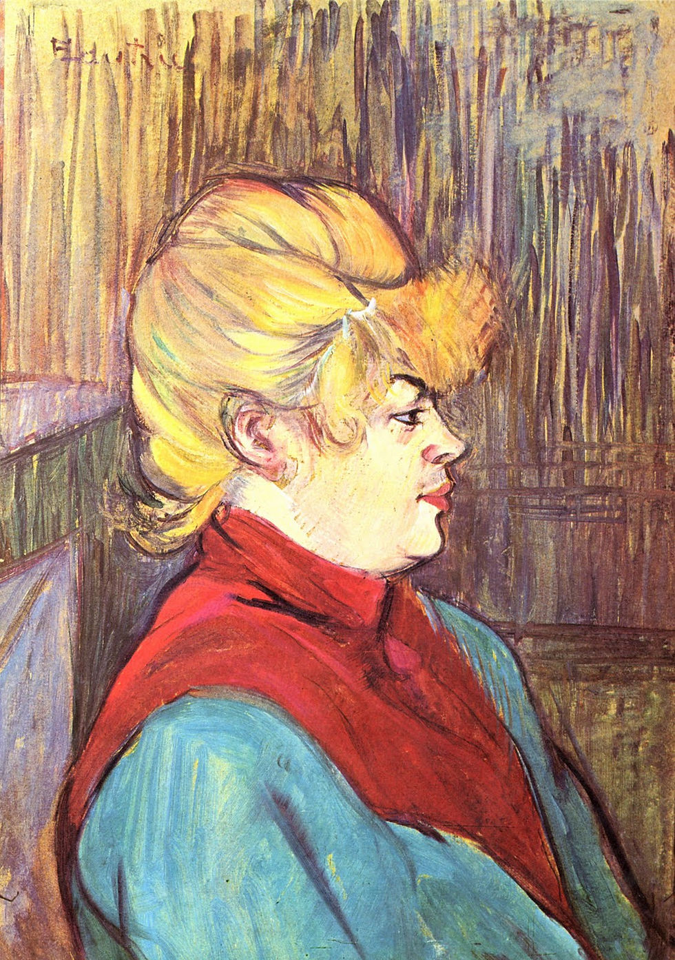
And Henri Toulouse-Lautrec...

And I have a few as well....


And of course, one of my favorites..... Primary Colors


Comments